Wedding websites
Black and White Wedding Website Ideas That Look Expensive (and Aren't)
You saw one somewhere, didn't you, lovely. A black and white wedding website that just looked... calm. Clean lines, a pretty serif, lots of white space, and somehow the whole thing felt expensive without trying. You saved it. And then the little voice showed up.
"If I do black and white, will mine look stark? Cold? Like I gave up on color?"
Or maybe the other worry. The one that says a look this polished must cost a designer's fee, or hours in a program you've never opened, and you don't have either to spare right now.
Here's the good news, and it's the whole point of this post: a black and white wedding website is the easiest elegant look there is. Not the hardest. The easiest. It reads expensive because it's confident, not because it's costly. And confidence, it turns out, is free.
Let me show you what actually makes the look work, hand you the exact words to fill it, and leave you with a site you'd be proud to send — without the late nights or the big budget.
Why black and white looks so expensive (the honest reason)
When we want something to look high-end, our instinct is to add. One more color, a fancier font, a little sparkle. That instinct is exactly what makes a page look like it's trying too hard.
Black and white does the opposite. It takes away until only the calm, sure things are left. Think of a crisp white shirt and dark trousers — no logo, nothing shouting, and it still looks pulled together every single time. Your wedding website works the same way. The look you love isn't a price tag. It's a handful of small, quiet choices, and every one of them is yours tonight.
That's the door I want to open for you. Beautiful was never meant to be reserved for big budgets, and a black and white wedding website might be the clearest proof of that. You don't spend more. You spend less, on purpose.
If you like this way of thinking, you'll like the sibling idea in our guide on giving your wedding website an "old money" look — same quiet-luxury spirit, a slightly different palette.
What makes a black and white wedding website work
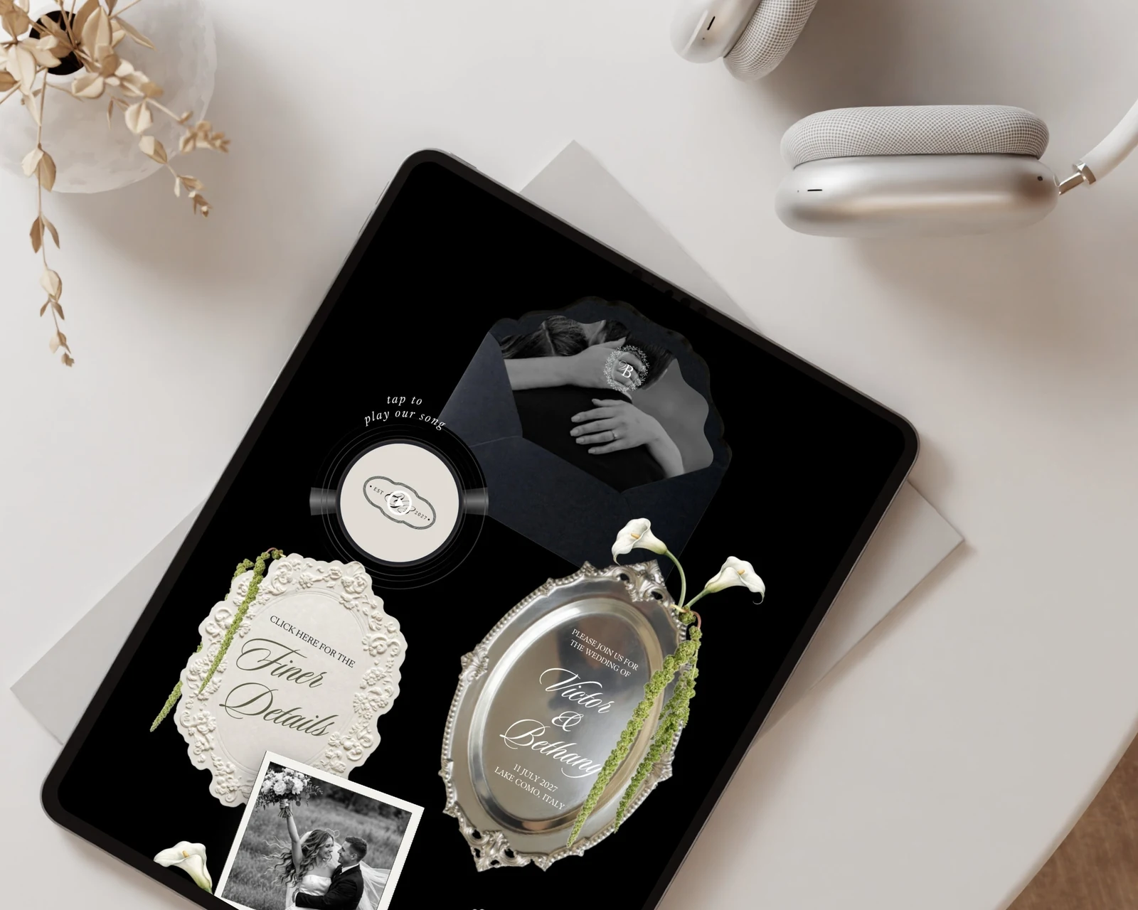
Before the words, the feel. Five small things do almost all the work here, and notice that not one of them costs a thing.
Real contrast. Black and white is all about the gap between light and dark. Keep your background soft — bright white, or a warm off-white like ivory — and your text a deep, true black or charcoal. That clean contrast is what makes the page feel sharp instead of muddy. Don't reach for gray text on a gray background; let the two colors do their job.
One small accent, if any. Pure black and white is lovely on its own. If you want a touch more warmth, add one quiet accent and stop there — a whisper of gold, a soft sage, a blush so pale it's almost a rumor. One. The moment you add a second, the calm slips away.
A font with a little backbone. Black and white almost always wants a serif — the kind with quiet, classic bones — or one very clean sans-serif. Pick one for headings and one for the rest, and let them repeat. Two fonts, used with lots of space, look far richer than five.
Room to breathe. The biggest tell of an expensive-looking page is space. Generous margins, one idea at a time, nothing crammed in. A crowded page feels anxious. An open one feels sure. When in doubt, take something off.
A few strong photos. One beautiful black-and-white image beats a busy gallery. Film-toned, candid, a little imperfect. And here's a small gift of this palette: turning your photos black and white hides a lot. A mismatched background, an odd color cast, a snapshot that didn't quite match your others — in black and white, they all suddenly belong.
That last point is why this look is so kind to real couples. You don't need a perfect photo shoot. You need a few good moments, and one shared filter to tie them together.
If clean-and-minimal is your happy place, our post on designing a minimalist wedding website that still feels luxe goes deeper on space and type — it's a close cousin to this one.
Copy-ready wording for your black and white wedding website
Here's the register you're going for on a black and white site: warm, but a little understated. Short sentences. Nothing loud. It should sound like a beautifully set table, not a sale sign. Copy any of these, swap in your details, and you're done.
Your welcome line sets the tone in one breath. Skip the all-caps excitement; let the calm carry it.
Classic:
Anna & James
[Month, Year] · [City, State]
We're so glad you're here. Everything you'll need is on this page — take your time.
Modern and simple:
We're getting married.
[Date] in [City]. Scroll down for the details, and thank you for celebrating with us.
Your story, worded quietly. A few true lines read richer than three long paragraphs.
We met in [year], in the least romantic place we can think of — [a laundromat / a work meeting / a friend's kitchen]. It took us a while to admit it, and no time at all once we did. We're getting married at [venue], surrounded by the people who were there for all of it.
Your details, stated plainly. On a black and white site, plain is the elegant choice.
Ceremony · [4:00 in the afternoon]
Reception to follow · [dinner and dancing]
[Venue name and address]
Your dress code. A black and white theme pairs beautifully with a dressier code, and the trick is to name it warmly, without a lecture.
We'd love to see you in black tie optional — think a dark suit or a floor-length dress. Dressing up is half the fun.
For every level of formality, worded kindly, our dress code page guide has copy-ready lines you can lift straight into your site.
Your RSVP, without the rush. No countdown clocks; a calm ask still gets a reply.
Kindly reply by [date]. You can respond right here on this page — it takes a minute, and it helps us plan the day with care.
For the rest of your pages in this same easy voice, our complete guide to wedding website wording hands you the words for every section, so you're never staring at a blank box.
One small thing to watch

Black and white is a little fragile in one way. It only takes one loud thing to break the spell — a bright button, a bouncy font used "for fun," a row of party emojis. The eye finds the loud thing, and the calm deflates.
So as you go, use one simple test: does this whisper, or does it shout? If it shouts, it goes. That's the entire skill. And honestly, loves, it's a relief of a skill — "remove the loud thing" is a much shorter to-do list than "add more polish."
You can have this tonight
Look at what a black and white wedding website actually asks of you. Two colors. One accent, at most. A calm font. Some space. A few photos on the same filter. Every one of those is a subtraction, not a project. This is the rare corner of wedding planning where the pretty choice is also the easy one — and the cheaper one, and the faster one, all at once.
If the blank page is the part that feels hard, that's exactly what a template is for. You don't build the look from scratch; the contrast, the type, the spacing, the restraint are already set the way you just read about. You drop in your names, swap in your photos, paste the wording above, and publish. We actually have two black and white wedding website templates built to feel exactly this timeless — the crisp, modern Fifth Avenue Black & White and the softer, heritage Old Money Black & White — and both are editable in the free version of Canva, so you get the whole quiet-luxury look without a single late night learning design.
Made it yourself. Looks like you didn't. That's the whole idea, and a black and white wedding website is the easiest place to prove it — quiet, classic, unmistakably yours, and no one ever has to know how simple it really was. 🤍
Every template is an editable Canva design with the wording already written — open it, swap in your names and photos, publish. The florals, envelopes and wax seals are drawn in-house, so your site doesn't look like anyone else's.
Browse the templatesKeep reading
— Easy Aisle Studio 🤍