You've seen it on your feed, lovely. The wedding that looks like it's been in the family for a hundred years — ivory and cream, a serif that whispers instead of shouts, everything calm and unhurried and quietly expensive. The "old money" look. Quiet luxury. And somewhere in the scroll, a small voice says: that's beautiful, but it looks like it costs a fortune I don't have.
Here's the loveliest secret about this particular aesthetic: it doesn't. Of all the looks you could give your wedding website, old-money quiet luxury is the most reachable one there is — because it's built on restraint, not spend. It's defined by what you leave out. And leaving things out is free.
So let's give your wedding website that heirloom, understated, quietly-lux feeling, the one that reads like taste instead of budget. I'll show you what actually makes a site look "old money," and then hand you the exact words to fill it, written in that quiet register so you're not staring at a blank page trying to sound effortless.
First, the reframe: quiet luxury is the opposite of expensive-looking
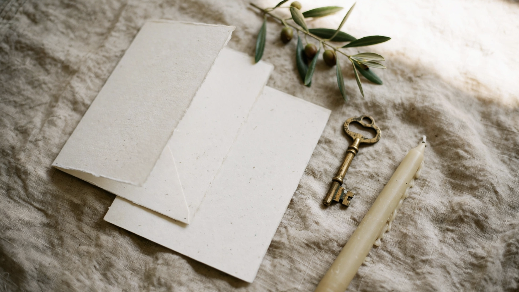
The instinct, when we want something to look high-end, is to add. More flourishes, a fancier font, a bolder color, a bit of shine. That instinct is exactly what makes a website read "trying." Old money does the reverse. It removes until only the calm, confident things are left.
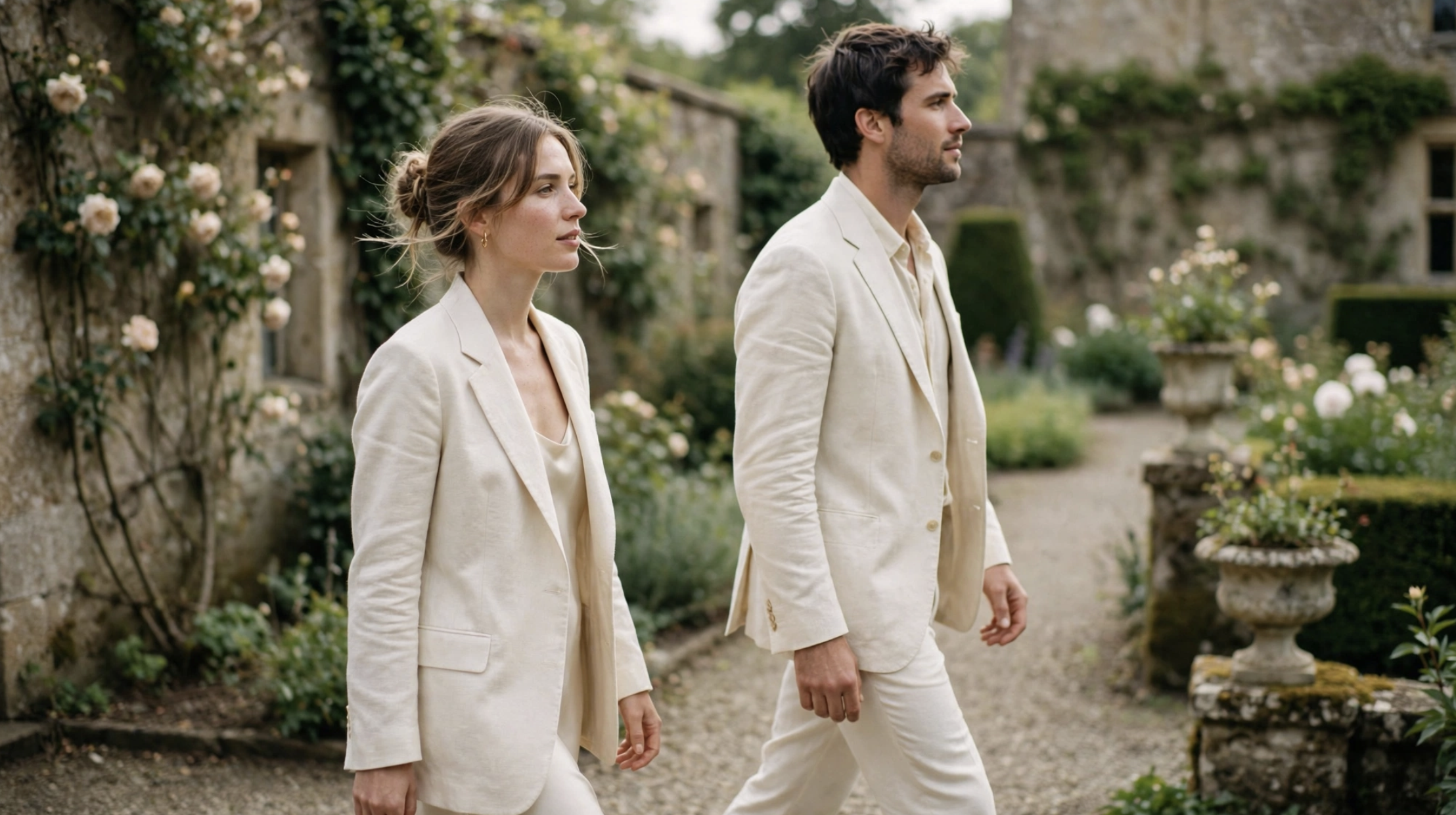
Think about what "quiet luxury" means in a wardrobe — a well-cut ivory coat, no logo, nothing shouting. It looks like money precisely because it isn't asking for attention. Your wedding website works the same way. The look you're after isn't a budget. It's a set of small, unhurried choices, and every single one of them is available to you tonight.
That's the door I want to open for you: beautiful was never reserved for big budgets, and this aesthetic proves it better than any other. You don't need to spend more. You need to spend less, on purpose.
What actually makes a wedding website read "old money"
Before the words, the feeling. Five quiet signals do almost all the work, and notice that none of them cost anything.
Restraint and room to breathe. The single biggest tell of quiet luxury is space. Generous margins, one idea per section, nothing crammed. A crowded page reads anxious; an uncrowded one reads assured. When in doubt, take something off the page.
A palette that stays home. Two or three soft, warm neutrals — ivory, champagne, oat, a single muted heritage tone like olive or dusty sage. No brights, no gradients, no more than about three colors total. The restraint is the richness.
A serif with a little history. Old money almost always means a serif, the kind with a quiet backbone, used at a calm size. Paired with plenty of white space, a classic serif does the heavy lifting all on its own. If you want the deeper design mechanics of getting this look right, our guide on how to design a minimalist wedding website that still feels luxe walks through palette, type, and spacing in more detail.
Photos that are few and unfussy. One beautiful image per section beats a gallery. Film-toned, candid, a little imperfect. Heirloom, not high-gloss.
Wording that never raises its voice. This is the one people miss, and the one that undoes the whole look when it's off. You can get the ivory and the serif perfect, then break the spell with pushy, over-excited copy. Old money is understated on the page too. Which is exactly where I can hand you the words.
Three quiet palettes you can borrow
If choosing colors is where you freeze, here are three old-money combinations that always read expensive because they always read calm. Pick one and don't add a fourth color. That restraint is the whole trick.
Estate ivory. Warm ivory background, soft olive for accents, a whisper of aged gold. This is the classic old-money palette: garden-party heritage, a little sun-faded, timeless.
Bone and charcoal. Oat and bone neutrals with a single deep charcoal for text. Quietly modern, a touch editorial, and beautifully legible. Lovely for a black-tie evening.
Champagne and sage. Champagne cream with muted sage green and the faintest blush. The softest of the three, and the most romantic without tipping into sweet.
Any of the three works because none of them shout. The magic isn't the specific colors so much as the discipline of stopping at three.
The quiet-luxury voice, page by page (copy you can paste)
Here's the register you're going for: warm, unhurried, a touch timeless. Short sentences. No exclamation points doing the work an em-dash could do more calmly. It sounds like a well-set table, not a sales flyer. Copy any of these, swap in your details, and you're done.
The welcome line
Your homepage sets the tone in one breath. Resist "We can't WAIT to celebrate!!" — the enthusiasm is lovely, the volume isn't. Try the quieter version:
Copy this and swap in your details:
Sarah & James [Month, Year] · [Town, State] We're so glad you're here. Everything you'll need is on this page — take your time.
That last line does something quietly luxurious: it tells guests there's no rush. Ease is the whole aesthetic.
The "our story," restrained
Old-money storytelling doesn't over-share. A few true, unhurried sentences read richer than three paragraphs of every detail.
Copy this and swap in your details:
We met in [year], in the least romantic place imaginable — [a laundromat / a work meeting / a friend's kitchen]. It took us [time] to admit it, and no time at all once we did. We're marrying at [venue], surrounded by the people who were there for all of it.
Notice the light, dry humor. Quiet luxury has a sense of ease about itself; a small, self-aware line keeps warm from tipping into stiff.
The details, worded quietly
Times, dress code, and logistics are where a calm site earns its keep. State them plainly. Plain is the elegant choice here.
Copy this and swap in your details:
Ceremony · [4:00 in the afternoon] Reception to follow · [dinner and dancing] Attire · [black tie] — we'd love to see you dressed beautifully.
On that dress code line: the old-money aesthetic pairs naturally with a more formal code, and the trick is to name it without a lecture. If you want the exact wording for every level of formality, our dress code page guide has calm, copy-ready lines for each.
The RSVP, without the urgency
Nothing breaks quiet luxury faster than a countdown clock. Ask calmly. People still reply.
Copy this and swap in your details:
Kindly reply by [date]. You can respond right here on this page — it takes a moment, and it helps us plan the day with care.
"Kindly," "with care," "take a moment" — small words, but they hold the register. For the rest of your pages in this same unhurried voice, our complete guide to wedding website wording gives you the words for every section.
Travel and where to stay, quietly
If guests are coming from out of town, the quiet-luxury move is to make the logistics feel like hospitality instead of homework. Warm, brief, handled.
Copy this and swap in your details:
For those travelling in, we've reserved a block of rooms at [Hotel] under [name]. It's a short drive from the celebration, and a lovely place to land. Any questions at all, we're only a message away.
"A lovely place to land," "only a message away" — the register stays soft while the information stays clear. That balance is the entire art of it.
Gifts, the understated way
The quiet-luxury register is perfect for the gift conversation, because it's already comfortable saying less.
Copy this and swap in your details:
Your presence is the gift — truly. For those who've asked, we've put together a few things [here], and a contribution toward [our first home / the honeymoon] would mean the world. No gift is ever expected.
If the cash-gift part feels delicate to word, our registry page guide handles it gently and gives you a few more ways to say it.
One small warning: don't let one loud thing undo it
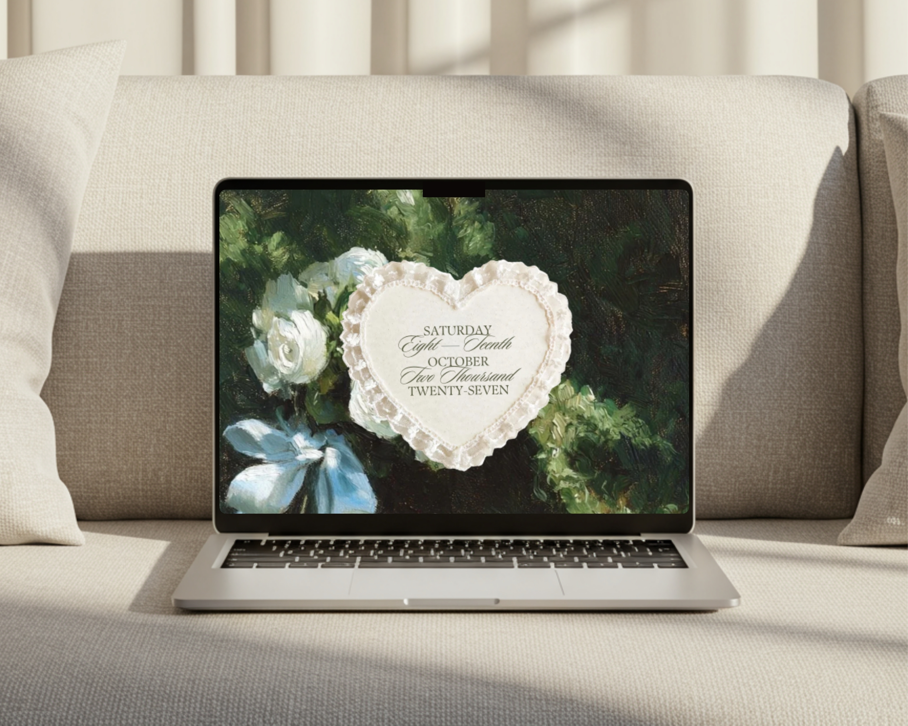
Quiet luxury is fragile in a specific way. It only takes one out-of-register element to break the spell — a bright accent color, a bouncy font used "for fun," a row of party emojis, a "BOOK YOUR TRAVEL NOW!!" banner. The eye finds the loud thing and the whole calm effect deflates.
So as you build, use one test: does this element whisper or shout? If it shouts, it goes. That's the entire discipline. And honestly, loves, it's a relieving discipline — because "remove the loud thing" is a much shorter to-do list than "add more polish."
You can have this tonight
Look at what quiet luxury actually asks of you: fewer colors, more space, a calm serif, a handful of unhurried words. Every one of those is a subtraction. This is the rare corner of wedding planning where the beautiful option is also the easier one — and the cheaper one, and the faster one, all at once.
If starting from a blank page is the part that feels hard, that's exactly what our wedding website templates are for. The ivory, the serif, the spacing, the restraint — the look is already built, calibrated to feel exactly this understated, so all you do is drop in the words above and publish. You get the heirloom-quiet-luxury site without spending an heirloom's worth, or a single late night learning design from scratch.
That's the whole idea behind Easy Aisle, and this aesthetic is the purest proof of it: made it yourself, looks like you didn't. Quiet, timeless, unmistakably yours — and no one ever has to know how reachable it really was. 🤍