There's a version of "simple" that looks like you gave up. Blank pages, default fonts, a color scheme that could generously be described as "beige." And then there's the kind of minimalist that stops people mid-scroll and makes them think: how is this so elegant?
If you're drawn to clean lines, white space, and the kind of design where less genuinely feels like more — this post is for you. Because minimalist doesn't have to mean boring. Done right, it actually looks more expensive than a wedding website crammed with every font and filter known to humankind.
Here's how to pull it off.
Why Couples Are Going Minimalist (And Why It Works So Well for Wedding Websites)
There's a reason minimalist design has dominated interior décor, fashion, and editorial photography for years. It feels intentional. It feels calm. And calm is a feeling your guests will genuinely appreciate when they're trying to find your venue address at 7:30 on a Friday morning.
Beyond aesthetics, minimalist wedding websites are also just easier to use. Guests don't have to hunt through dense paragraphs or scroll past three different announcement banners to find the RSVP form. Everything they need is there — obvious, clear, and beautiful.
For couples planning a modern wedding, a minimalist site also tends to age better. You won't look back in three years and cringe at the glitter overlays.
Start With Your Color Palette (Fewer Colors = More Impact)
The single most important decision you'll make for a minimalist wedding website is your color palette. And the golden rule here is: limit yourself to two or three colors, max.
That doesn't mean you have to go full black-and-white (though that's stunning if it suits you). It means picking one anchor color, one neutral, and maybe one soft accent — and then sticking to it everywhere, consistently.
Some combinations that work beautifully in a minimalist context: warm ivory with black and a single deep terracotta. Soft sage with cream and warm taupe. Cool grey with white and dusty rose. The contrast does the work. You don't need five colors fighting for attention.
Pro tip: Pull your palette from one of your wedding photos or engagement photos. When your website colors echo your actual visuals, the whole thing feels cohesive in a way that's hard to fake.
Typography Is Doing More Work Than You Think
On a minimalist website, you can't lean on elaborate backgrounds or decorative elements to carry the design. Your fonts have to work. And the good news is that two well-paired fonts — one serif, one clean sans-serif — can create something genuinely stunning on their own.
Think of a delicate, slightly vintage serif font for your names or section headings. Pair it with something crisp and modern for body text. That contrast between romantic and structured is exactly what makes minimalist wedding design feel luxe instead of flat.
What to avoid: using too many font styles, mixing three or more typefaces, or choosing anything that's hard to read on mobile. If your guests can't quickly scan your schedule page while standing in a parking lot, the beautiful font choice is doing you no favors.
Pro tip: When in doubt, bigger is better. Oversized typography — like your names displayed large across the homepage — is a classic minimalist move that feels intentional and editorial.
White Space Is a Design Choice, Not an Accident
Here's something that might feel counterintuitive: leaving space empty on your website is not a sign that you ran out of things to say. It's a design choice. It's what separates a clean, premium-feeling layout from one that looks cluttered and exhausting.
White space (or negative space) is the breathing room around your text, images, and sections. It's what gives each element room to land before the next one appears. When pages feel calm and uncluttered, readers actually read more — they're not overwhelmed before they even start.
So resist the urge to fill every gap. If a section feels "too empty," sit with it for a day before adding anything. You might find it's actually just right.
Photos: Fewer, Better
A minimalist website doesn't need a gallery of 40 engagement photos. It needs maybe four to six photos that are genuinely beautiful and tell a story on their own.
Quality over quantity is the rule here. One stunning photo of the two of you, one shot of your venue, and a couple of detail or atmosphere images can carry an entire website. Especially if those photos share a consistent editing style — similar tones, similar light, similar mood.
If your photos aren't all cohesively edited, that's okay. Pick the ones that feel most similar and use those. Or lean into black and white, which unifies almost any set of images instantly.
Pro tip: For a minimalist site, full-width or near-full-width photos hit harder than small thumbnails. One stunning image stretched across the screen does more work than six cramped photos in a grid.
Navigation: Keep It Ruthlessly Simple
Every extra page on your wedding website is a decision your guests have to make. Do I click on "Our Love Story" or go straight to "Travel Info"? The more options, the more friction.
A minimalist wedding website typically has five to seven pages at most: Home, Our Story, Details, Travel & Stay, Registry, RSVP, and FAQ. Some couples trim it further — collapsing travel info and FAQs into a single page, or combining the schedule with the details page.
The question to ask for every section: does this make my guests' lives easier, or does it just make me feel like I covered everything? Ruthless editing is part of the minimalist philosophy.
Wording That Matches the Vibe
Your design can be beautifully minimal, but if your copy is long-winded and overwrought, the effect falls apart. Minimalist design and concise writing go hand in hand.
This doesn't mean cold or impersonal. It means every sentence earns its place. Instead of three paragraphs about how you met, tell the story in four to six sentences. Instead of a lengthy dress code explanation, two crisp lines will do.
Here's an example of copy that matches a minimalist aesthetic:
"We're getting married in the garden as the sun sets. Think flowy, earthy, and comfortable. Formal optional — joy mandatory."
Compare that to a more verbose approach and you'll immediately feel the difference. Brevity here isn't laziness — it's confidence.
Pro tip: Write your copy long first, then cut it by a third. You'll almost always find the second version is better.
Canva Design Tips for Getting the Minimalist Look Right
If you're building your wedding website in Canva, a few specific choices will instantly elevate a minimalist layout.
First, turn off every decorative element that isn't doing meaningful work. Floral borders, texture overlays, watercolor backgrounds — these aren't inherently bad, but they fight against the clean aesthetic you're going for. Strip back to the essentials and see how it looks.
Second, use alignment deliberately. Centered text feels soft and romantic. Left-aligned text feels modern and editorial. Pick one and use it consistently — mixing both on the same page usually looks unresolved.
Third, maintain consistent spacing between sections. If you have 40 pixels of space above one section heading, use 40 pixels above every section heading. This sounds tedious, but visual consistency is what separates a "nice" website from one that looks professionally designed.
Making Minimalism Feel Warm (Not Cold)
The most common concern couples have about minimalist design: what if it feels sterile? What if guests land on the site and think it feels impersonal or corporate?
The fix is warmth through specificity. A minimalist layout with personal details — your actual love story, a genuine photo of the two of you laughing, copy that sounds like how you actually talk — never feels cold. Cold is generic. Your specific details make it warm.
Include one or two small, personal touches that are yours alone. A quote from something meaningful to you. A mention of the restaurant where you got engaged. Your dog's name in the FAQ section when you explain why there are no pets allowed at the venue. These moments of personality don't clutter the design — they humanize it.
If You Want the Look Without the Work
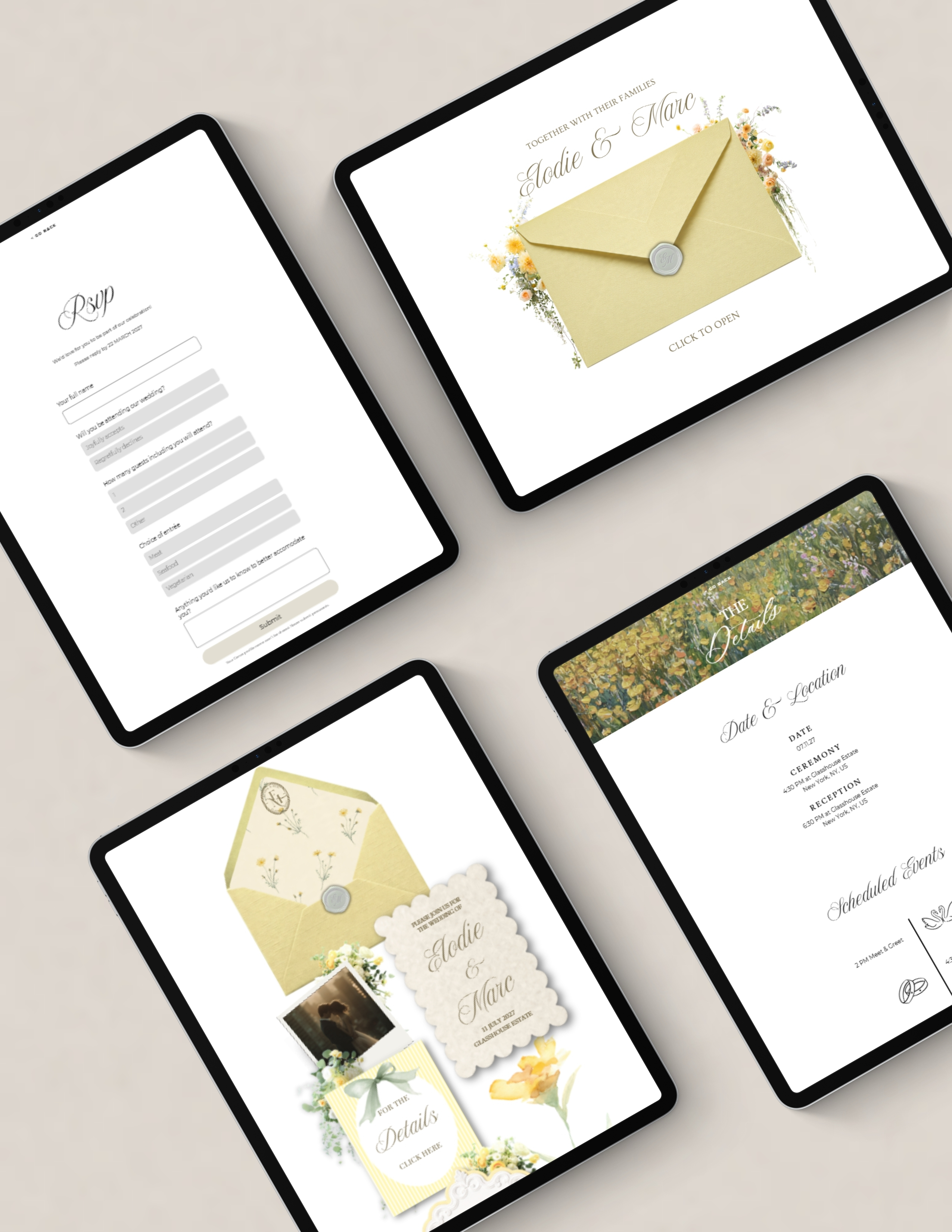
Here's the honest truth about building a minimalist wedding website from scratch in Canva: getting it right takes longer than it looks. The spacing, the font pairing, the color harmony — all of it requires attention and, frankly, a bit of a design eye.
That's where starting from a well-designed template changes everything. A good minimalist template already has the hard decisions made: the right fonts are chosen and paired, the spacing is deliberate, the color palette is balanced. You're not guessing — you're customizing.
You swap in your names, your photos, your wording, and your details. You keep the structure that already looks beautiful, and you make it yours. The result is a website that looks like it took hours of design work when it actually took one focused evening.
Browse our templates to find a minimalist style that matches your vision — whether you're drawn to something cool and editorial, warm and earthy, or clean and classic. The structure is ready. You just bring the love story.
Chasing the “old money” or quiet luxury wedding website look? Minimalism is how you get it — a restrained palette, refined type, and plenty of white space. For the words to fill every page, see what to write on every page of your wedding website.