If you've been scrolling through wedding website examples online and thinking "these are all either way too formal or look like they were made in 2015," you're not alone.
The thing is, most wedding website templates are designed for... well, not you. They're designed for everyone, which means they often end up feeling like no one. But your wedding website should actually reflect your style—whether that's clean and minimal, warm and earthy, bold and colorful, or something else entirely.
In this post, we're breaking down five modern wedding website aesthetics that actually resonate with couples in their 20s and 30s. We'll show you what each style looks like, who it's perfect for, and exactly how to pull it off (without needing a design degree).
1. The Minimalist: Clean, Elegant, and Effortlessly Chic
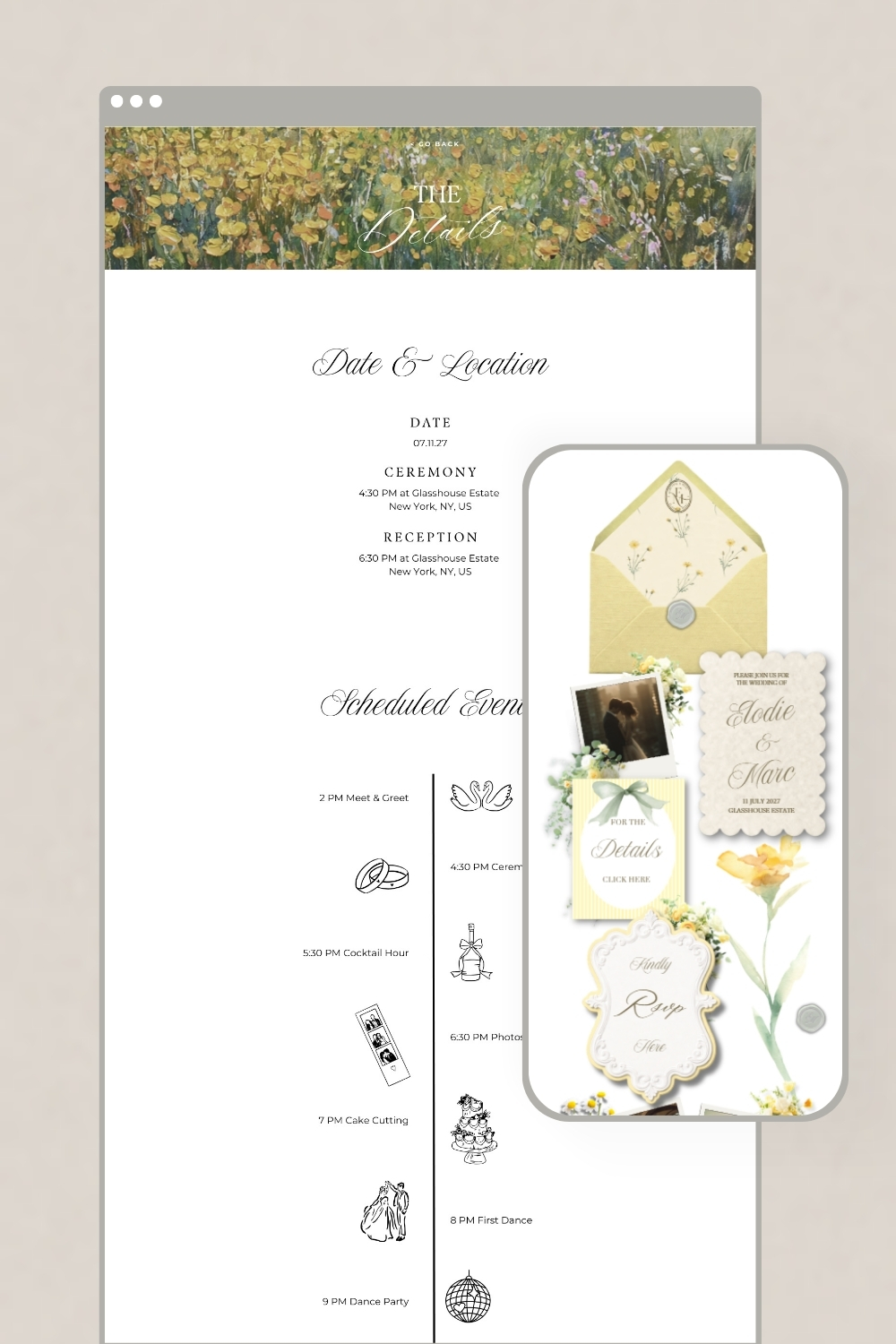
Who it's for: Couples who love clean lines, lots of white space, and the kind of aesthetic that makes your Instagram feed look curated without trying too hard.
What it looks like:
- Tons of white or neutral backgrounds
- One or two carefully chosen accent colors (think black, sage, terracotta, or soft gray)
- Simple, modern fonts—nothing overly decorative
- High-quality photos with breathing room around them
- Clean section dividers, no busy patterns or textures
The vibe: Think of a beautiful art gallery or a really good Scandinavian design blog. Everything has space. Nothing feels cluttered. Your eyes know exactly where to look.
How to make it work:
Use negative space generously—don't feel like you need to fill every inch of the page. Choose one accent color and stick with it throughout. Keep fonts simple and limit yourself to two maximum. Let your photos be the main visual element, not graphics or illustrations.
Perfect for: City weddings, loft venues, modern industrial spaces, outdoor ceremonies with clean contemporary details.
2. The Earthy Romantic: Warm, Natural, and a Little Bohemian
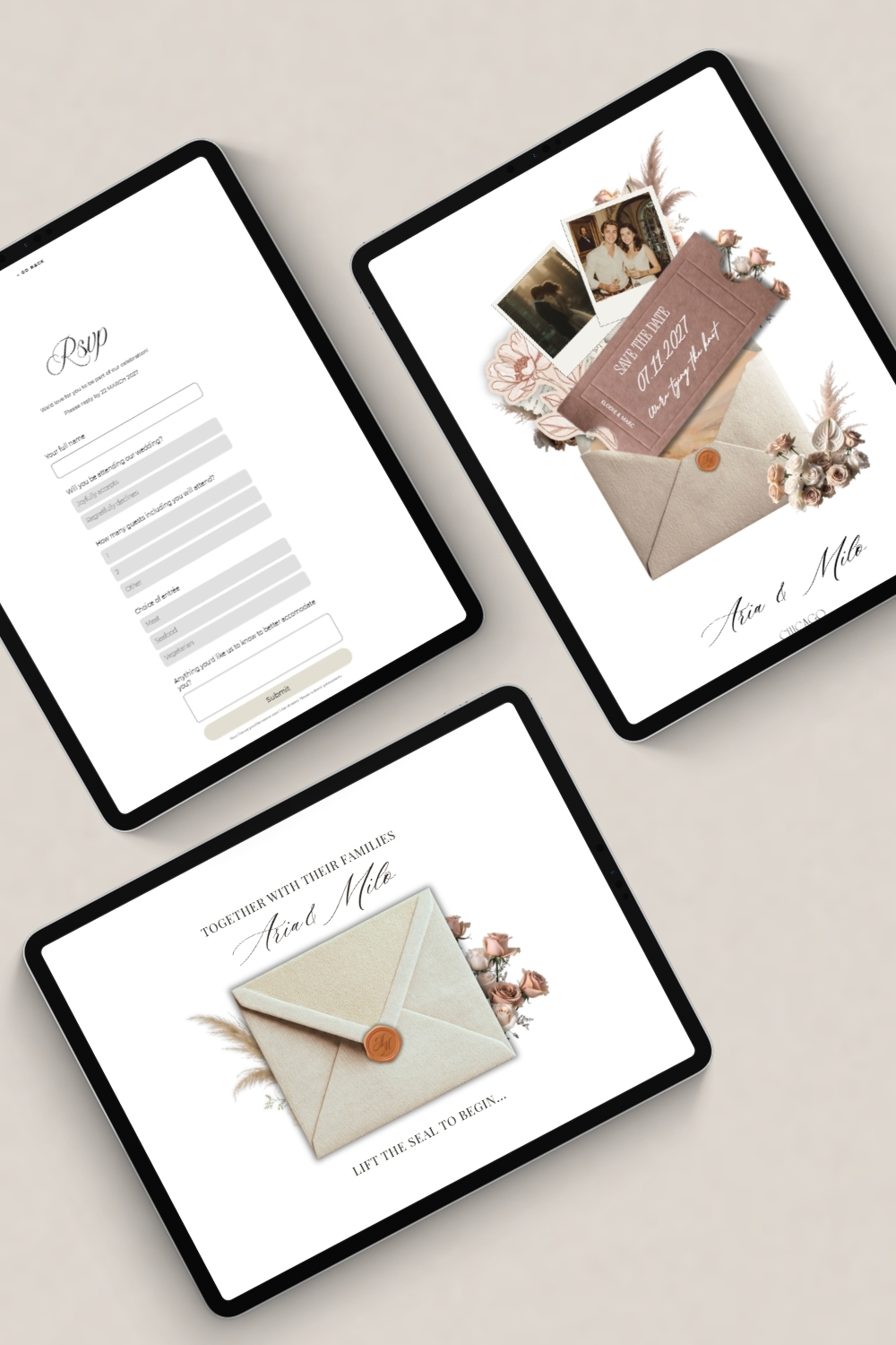
Who it's for: Couples planning garden weddings, outdoor celebrations, or anything that involves string lights, natural wood, and a lot of greenery.
What it looks like:
- Warm, earthy tones: terracotta, sage green, cream, dusty rose, rust
- Organic textures and subtle botanical elements
- Script or handwritten-style fonts paired with something clean for body text
- Photos that feel natural and candid, ideally outdoors
- Soft, romantic but never overly formal
The vibe: Think golden hour light, linen tablecloths, wildflower bouquets, and the kind of reception where everyone's dancing barefoot by the end of the night.
How to make it work:
Layer warm, muted colors instead of bright ones. Add subtle botanical touches—a small leaf illustration, a soft watercolor wash. Choose fonts that feel handwritten but are still easy to read. Use photos that capture natural moments, not stiff poses.
Perfect for: Garden weddings, vineyard ceremonies, farm venues, beach celebrations, anywhere outdoors with a natural backdrop.
3. The Editorial: Bold, Sleek, and Unapologetically Modern
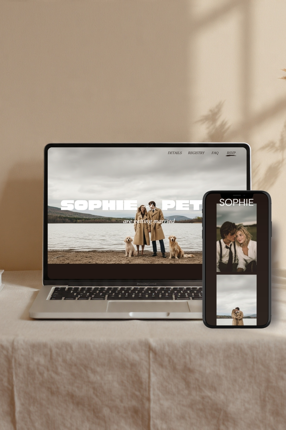
Who it's for: Couples who love fashion, design, and want their wedding to feel like it could be featured in a magazine. You know who you are.
What it looks like:
- High-contrast color palettes: black and white with one bold accent color
- Strong, geometric layouts with intentional asymmetry
- Modern serif or sans-serif fonts, nothing whimsical
- Editorial-style photography—think crisp, well-composed, intentional
- Clean lines, sharp edges, confident design choices
The vibe: Your wedding website could double as a lookbook. It's the kind of aesthetic that says "we thought about this" without saying it out loud.
How to make it work:
Don't be afraid of black. Use it generously. Choose one bold accent color (red, emerald, cobalt, hot pink) and use it sparingly but intentionally. Keep your layout structured and clean—no soft, whimsical elements here. Use strong, confident fonts.
Perfect for: Urban weddings, rooftop venues, loft spaces, art galleries, modern hotels, anywhere with clean architectural lines.
4. The Warm Classic: Timeless, Elegant, Without Feeling Stuffy
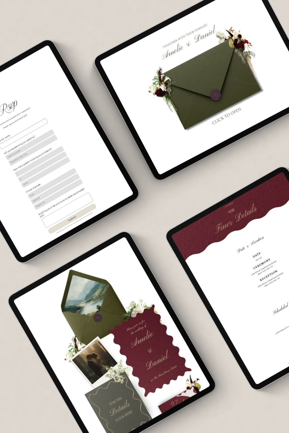
Who it's for: Couples who want something traditional and beautiful but definitely not your grandparents' wedding. Think classic with a modern refresh.
What it looks like:
- Rich, warm tones: navy, burgundy, forest green, champagne, gold
- Elegant serif fonts paired with clean sans-serifs
- Symmetrical layouts that feel balanced and intentional
- Sophisticated but warm—never cold or overly formal
- Classic details like subtle borders, elegant dividers, refined touches
The vibe: A beautiful dinner party at a historic estate. Candlelight, good wine, everyone dressed up but relaxed. Timeless without feeling dated.
How to make it work:
Use classic color combinations (navy and gold, burgundy and cream, forest green and ivory). Choose elegant, readable fonts—serif for headings, sans-serif for body text. Keep layouts symmetrical and balanced. Add refined details like subtle borders or thin dividers.
Perfect for: Historic venues, ballrooms, country clubs, classic hotels, vineyards, anywhere with traditional architecture or refined interiors.
5. The Bold and Colorful: Fun, Vibrant, and Full of Personality
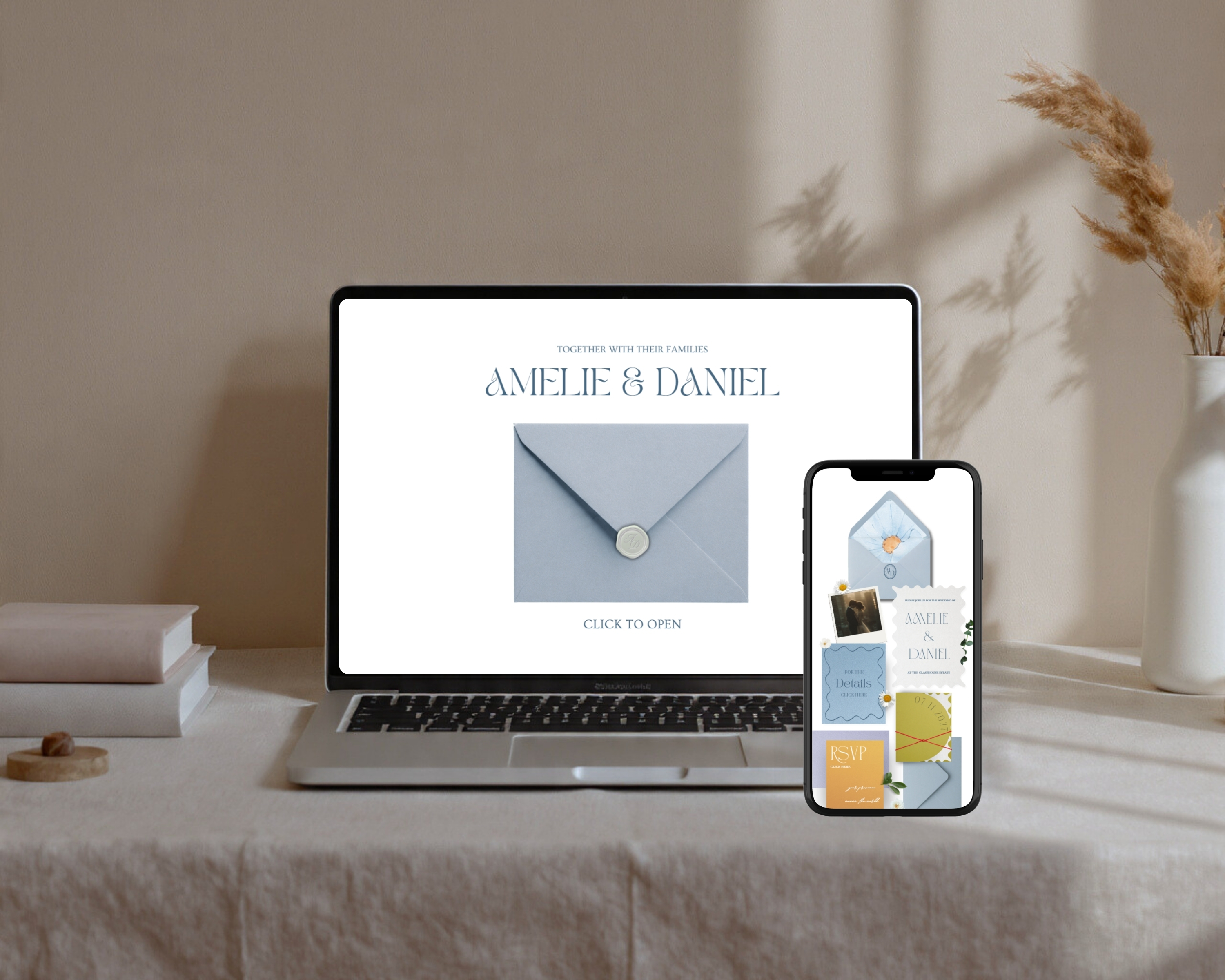
Who it's for: Couples who are not here for "subtle" and want their wedding to feel like the best party anyone's been to all year.
What it looks like:
- Saturated, happy colors: bright pinks, corals, yellows, blues, greens
- Playful fonts and unexpected color combinations
- Fun illustrations, patterns, or graphic elements
- Photos that are bright, joyful, and full of energy
- Nothing beige, nothing boring
The vibe: Confetti cannons. A really good playlist. That one wedding everyone still talks about three years later. Your website should make people smile before they even RSVP.
How to make it work:
Don't hold back on color—use multiple bright tones and let them play off each other. Choose playful fonts that still feel modern, not childish. Add fun graphic touches like geometric shapes, playful illustrations, or bold patterns. Keep the energy high throughout.
Perfect for: Colorful outdoor weddings, rooftop parties, nontraditional venues, destination weddings, anywhere you're prioritizing fun over formality.
How to Choose the Right Style for Your Wedding
Not sure which aesthetic is yours? Here are a few questions that can help:
If you had to describe your home's decor in three words, what would they be? (Your wedding website should probably match.)
What's your go-to outfit for a nice dinner? (Classic and elegant? Edgy and modern? Relaxed and earthy? That's a clue.)
When you picture your wedding venue, what's the first word that comes to mind? (Romantic, modern, bold, timeless, fun?)
What kind of wedding photos do you find yourself saving on Instagram or Pinterest? (Look at the colors, the mood, the overall vibe—there's your answer.)
Your wedding website doesn't need to be neutral and generic just because "it's a wedding." It can actually look like you. And honestly? Your guests will appreciate it way more when it does.
The Fastest Way to Get This Look
Here's the thing about creating a beautiful, modern wedding website that feels genuinely like your style: you don't need to be a designer, and you definitely don't need to start from scratch.
Our Canva wedding website templates come in all of these aesthetics—minimalist, earthy romantic, editorial, warm classic, and bold colorful. Each one is fully designed, completely customizable, and ready to go in under an hour.
You just pick the style that feels like you, drop in your details and photos, and tweak the colors if you want. That's it. No learning curve, no design stress, just a beautiful website that actually reflects your vibe.
Here's what you get with every template:
✓ Multiple pre-designed pages: Home, Our Story, Venue, Travel, RSVP, FAQ, Registry
✓ Ready-to-use layouts in five distinct aesthetic styles
✓ Easy color and font customization in Canva
✓ Mobile-friendly designs that look great on any device
✓ Sample copy for every section so you're never staring at a blank page
Ready to find your style? Browse our full collection of wedding website templates and see which one feels like home.